Thursday, May 7, 2009
Monday, April 27, 2009

This is the non-smoking poster I created. The red font I chose is to make the words stand out in front of the dark smoke coming from the cigarette. I picked a chemical that is in the smoke of a cigarette to get people to realize what they're really smoking. when you breath out the smoke you're basically killing non-smokers by second hand smoke.
Tuesday, April 14, 2009
Friday, April 3, 2009
L.C.I Tech Challenge Logo

The following are the different colour choices with the L.C.I Tech Challenge logo that i created. The brain represents the new ideas technology thrives on. I made this logo to try to catch the eyes of the youth. I picked the font carefully to tie into the technology theme. The brain is the main focal point bacause it is the main message and i put the written surrounding it to create unity.
Monday, March 9, 2009
Cd Album

The font for Spirits of The Nether World on the album cover was chosen because it looked sort of eery like the word spirit. Nether world means under world so that also adds to the eery feel but i made that bold so that it would be the main focus over the tigers head. Breech Lock is the title and i made it pretty simple but in a place where you can see it clearly.
Thursday, March 5, 2009
Principles of Design
Wednesday, February 25, 2009
The Elements of Design
Tuesday, February 17, 2009
Free Form Illustration

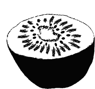
This free form image was created with three different brush tools. For the seeds I used the elipse tool and stretched them to the size I wanted just like the first kiwi image. I filled the inside of the kiwi black to have contrast with the seeds as well as the center. The jagged edges on the bottom was to portay the fuzzy look of the kiwi skin.
Thursday, February 12, 2009
Kiwi vector drawing

This is the vector based object that i created on Illustrator. It's a kiwi. First I outlined the picture with the pen tool, then filled the bottem half with black. On a different layer I used two differnt brush tools to show the effect of the lines in a kiwi. Then I made circles for the seeds and stretched them to different sizes.
Subscribe to:
Posts (Atom)


